Ethan Crossfield
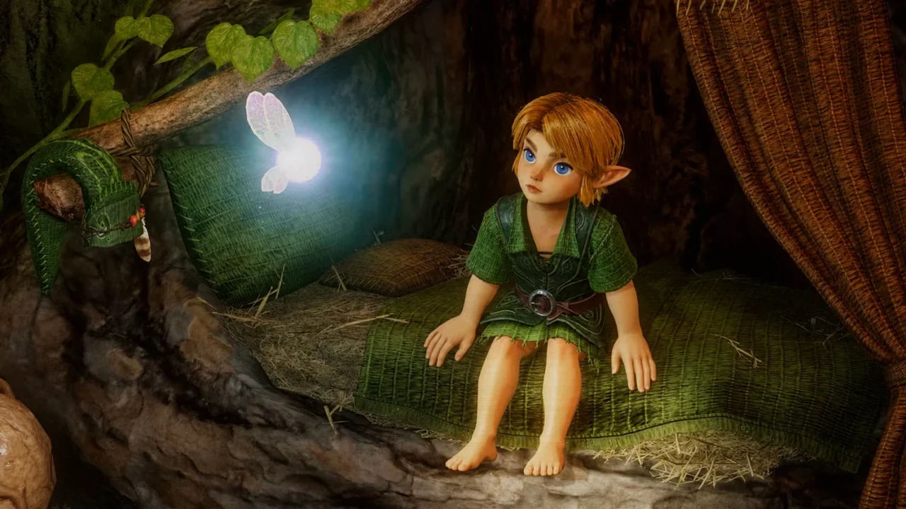
Technical constraints have often defined gaming’s most enduring ideas, from visual styles to interface systems players instantly recognize. A resurfaced Nintendo development interview shows that Navi, Ocarina of Time’s famously persistent fairy companion, was one such case: she was initially envisioned as a human-like character before Nintendo 64 limitations pushed the team toward the glowing, winged orb that became inseparable from Link’s adventure.
A targeting tool became a Zelda character
Navi was not originally planned as the prominent guide players remember. Designer Yoshiaki Koizumi was working on the game’s Z-targeting system and felt that a basic marker above enemies did not suit the world of Zelda. The answer was a fairy that could visually identify targets while feeling like a natural part of Hyrule. The concept was first known as the Fairy Navigation System, tying Navi’s eventual identity directly to one of Ocarina of Time’s most important gameplay innovations.
N64 hardware changed the original concept
Koizumi’s first instinct was reportedly to make the fairy resemble a cute girl, an approach that would have aligned with how fairies had appeared in earlier Zelda games. However, that more detailed design was not practical for the Nintendo 64 hardware. The final version was therefore simplified into a bright ball of light with wings. What began as a technical compromise gave Navi a clean silhouette that was easy to recognize during combat and exploration, particularly when players needed fast visual feedback from Z-targeting.
Navi’s role expanded alongside the game
The team did not stop at using the fairy as an aiming indicator. Script director Toru Osawa suggested shortening the navigation concept into the name Navi, while further ideas turned her into an in-world source of guidance. Plans included using her colors to communicate targeting information, and her hint system offered a way to help players navigate Zelda’s first major 3D adventure. Her recognizable callouts became part of that function, even as they later became a long-running community joke.
The remake keeps the familiar fairy intact
Nintendo’s upcoming Switch 2 remake is set to rebuild the 1998 game with updated visuals, voiced cutscenes, expanded dialogue, orchestral music, additional movement options, and modern camera controls. Despite those wider changes, official footage and screenshots retain Navi’s established glowing design. The decision suggests that Nintendo sees the character’s simplified appearance not as outdated hardware baggage, but as a defining piece of Ocarina of Time’s visual language.
Key points
- Navi began as a visual solution for Ocarina of Time’s Z-targeting system.
- Koizumi initially considered a human-like fairy design.
- Nintendo 64 limitations led to Navi’s glowing orb-and-wings appearance.
- The Switch 2 remake retains Navi’s classic visual identity.
Navi’s concept versus her final role
| Development idea | Final implementation |
|---|---|
| A human-like fairy | A glowing ball of light with wings |
| A targeting marker | A companion tied to Z-targeting and player guidance |
| Fairy Navigation System | Navi |
Expert View
This is a useful reminder that iconic game design is not always the result of unlimited technology. Navi’s final form solved readability, performance, and world-building needs at once, which made her more memorable than a more elaborate model may have been. For Nintendo, preserving that silhouette in a modern remake signals that heritage design remains valuable: upgrades can modernize presentation and controls without replacing the visual shortcuts that helped define a classic.